My Watercolour Palette for Nature Journaling (2026)
Finding the right palette for nature journaling turned out to be much harder than I expected.
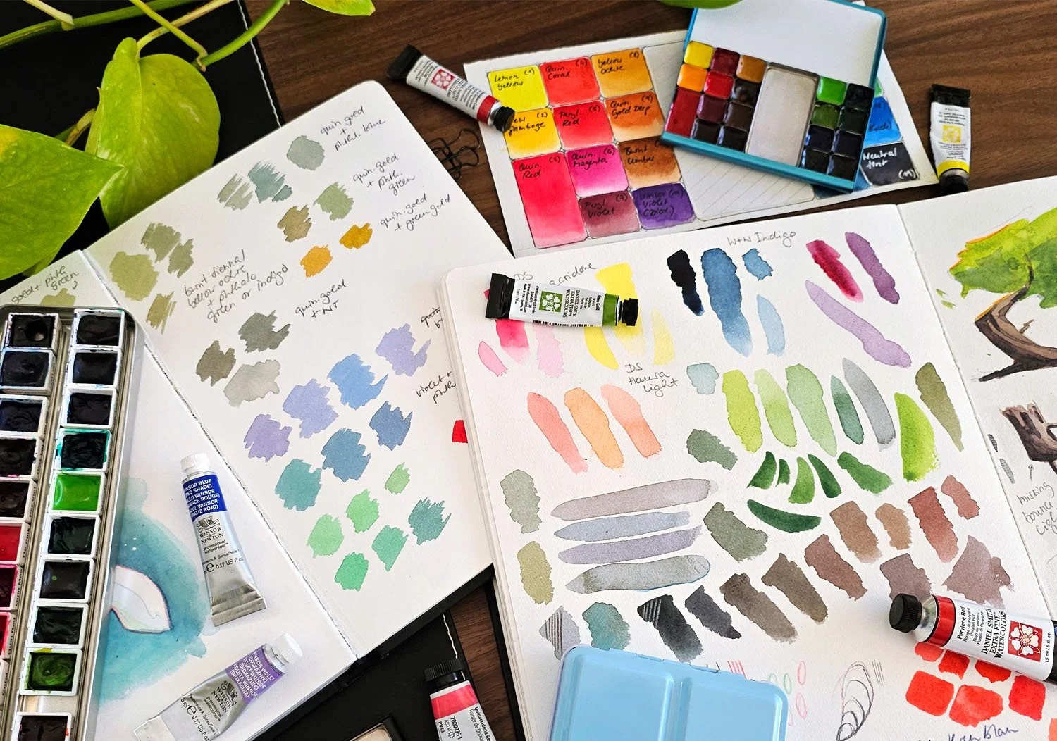
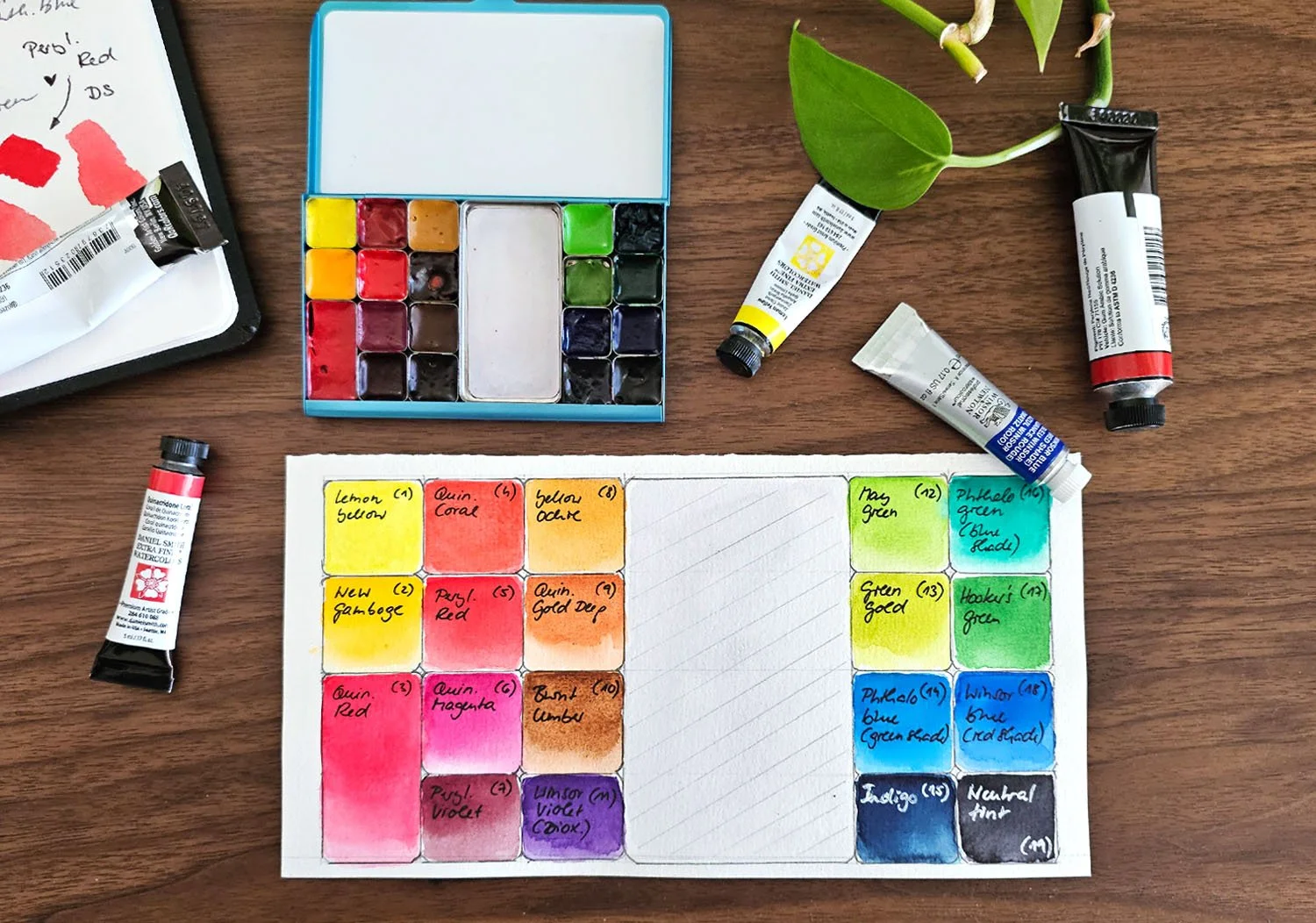
This is my current watercolour palette for sketching in the field. It took me forever to select the colours I wanted to include. Every time I thought I had made a final decision, I got a serious case of FOBO (fear of better options) and ended up changing everything again. But now I’ve finally settled on 19 colours (see the list below).
Choosing the palette itself turned out to be another challenge. I experimented with a lot of different options, from large palettes to very tiny ones, but in the end I came back to the Pocket Palette from Art Toolkit. What I love most about this palette is how lightweight it is, which makes it perfect for working outdoors.
The only thing that bothers me is the limited mixing space. For a while I experimented with a larger palette, but I found it too heavy and awkward to handle in the field.
My current colour selection (2026)
So, here is the list of the colours I’ve included. I added the pigment code, so you can look for the same colour from a different brand.
Lemon Yellow (DS) / Pigment PY175
New Gamboge (DS) / Pigment PY 97 & PY 110
Quinacridone Red (QOR) / Pigment PV19
Quinacridone Coral (DS) / Pigment PR209
Perylene Red (DS) / Pigment PR178
Quinacridone Magenta (QOR) / Pigment PR122
Perylene Violet (WN) / Pigment PV29
Yellow Ochre (WN) / Pigment PY43
Quinacridone Gold Deep (QOR) / PO48
Burnt Umber (DS) / Pigment PBr7
Winsor Violet (WN) / Pigment PV23
May green (Schm) / Pigment PY151 & PG7
Green gold (DS) / Pigments PY150, PY3 & PG36
Phthalo blue - green shade (DS) / Pigment PB15:3
Indigo (WN) / Pigment PB15, PBk6 & PV19
Phthalo green - blue shade (QOR) / Pigment PG7
Hooker’s green (DS) / Pigment PG36, PY3,PO48 & PY150
Winsor Blue - red shade (WN) / Pigment PB15
Neutral Tint (WN) / Pigment PB15, PBk6 & PV19
(WN = Winsor & Newton; DS = Daniel Smith; Schm = Schmincke)
What made me choose these colours?
As a general remark: I try to use the glazing technique for applying watercolour. Because of that I prefer transparent and high staining single pigments. I also usually stay away from granulating paint. You might prefer different characteristics. It really comes down to personal preference and your workflow.
If you are interested here is a short summary of why I chose the colours:
(🩷 = favourite colour)
Lemon Yellow (DS), Pigment PY175
A cool yellow is a must have. Normally, I use Hansa Yellow Light (DS, PY3) but I saw that PY175 is a bit more transparent and has a slightly better lightfastness. So I thought I would give it a try.New Gamboge (DS), PY97 & PY110
A transparent warm yellow, leaning towards orange. It’s perfect to warm up PY175 and to mix beautiful oranges together with the red pigments.Quinacridone Red (QOR), Pigment PV19 🩷
My favourite red (technically a violet). It’s intense, transparent, high staining - just perfect.Quinacridone Coral (DS), Pigment PR209
Ok, here is the thing: I dislike warm reds or rather I dislike how the pigments behave on paper. They all seem to dry out very dull compared to the cooler reds. Quin. Coral does create beautiful colour variations when charged into PV19 though.Perylene Red (DS), Pigment PR178
A recent discovery. This is a semi-transparent warmer red. I am currently experimenting with it. So far I like how intense the colour is even when dry.Quinacridone Magenta (QOR), Pigment PR122 🩷
A gorgeous pink. Works beautifully on its own or with PV19 for some colour variation.Perylene Violet (WN), Pigment PV29 🩷
I love this colour for creating vibrant shadows on red subjects, mixing it with blues and sometimes as an alternative for brown.Yellow Ochre (WN), Pigment PY43
A semi-opaque colour, which I find difficult to work with. It is a beautiful natural yellow brown, though. I try not to mix it with or glaze it on top of other colours.Quinacridone Gold Deep (QOR), PO48 🩷
This pigment is discontinued by QOR and many other manufacturers but you can still get it from Daniel Smith. It’s a gorgeous warm transparent orangy-brown. It’s great for top layers if you want to make a subject look “sun kissed”. I am going to cry when this pigment eventually runs out…Burnt Umber (DS), Pigment PBr7
I was looking for a dark brown as a convenience colour for painting tree bark for example. Most browns lean too much towards red for my taste. I considered Sepia but decided against it because of its opaqueness. Burnt Umber is semi-transparent and granulating which I like in this specific case because it gives some texture when painting tree bark and such.Winsor Violet (WN), Pigment PV23 🩷
I love this colour. I mix it into or layer it on top of everything to create interesting shadows.May Green (Schm), Pigment PY151 & PG7 🩷
My favourite green. It’s way too artificial-looking for most natural subjects, but I love it. Everything green should be this green. Luckily my art is rather stylized so I get away with using this colour. I love how it mixes with PG7 and PB15:3.Green Gold (DS), Pigments PY150, PY3 & PG36
Another lovely green. Much like PO48 it works great as a top layer to intensify the green colour on a subject where the sun hits it.Phthalo Blue - green shade (DS), Pigment PB15:3 🩷
My favourite cool blue. High staining, transparent, perfect.Indigo (WN), Pigment PB15, PBk6 & PV19 🩷
My alternative for black and another favourite. It’s great for muting down colours that are too intense. Even though it’s opaque I find it mixes well with other colours. Note: I do like Indigo from Winsor and Newton specifically.Phthalo Green - blue shade (QOR), Pigment PG7 🩷
Another very artificial looking green I love. Great for mixing all kinds of interesting colours.Hooker’s Green (DS), Pigment PG36, PY3,PO48 & PY150
Not quite sure about this one. I included it as a starting point to mix more natural greens. Time will tell how much I end up using it.Winsor Blue - red shade (WN), Pigment PB15 🩷
A natural choice would have been Ultramarine, but I don’t really like it too much (shocking, I know). So, when I was looking for a warmer blue to complement the Phthalo blue I fell in love with this one. It is a high staining blue which is perfect, the only downside is that lifting out clouds when painting skies is a little more difficult.Neutral Tint (WN), Pigment PB15, PBk6 & PV19
I like having Neutral Tint as a convenience grey and sometimes I use it instead of indigo to mute down other colours.
I am really looking forward to experimenting with these colours and figuring out what works and what doesn’t and I hope this post was helpful or interesting in some way.
Let me know in the comments how many colours you have on your palette. I am really curious.